Today’s healthcare websites transcend beyond mere repositories of information; they represent critical junctures in the patient-care continuum. The user experience (UX) they deliver not only shapes patient engagement but also underpins the trust and credibility of healthcare providers. This article unpacks seven cardinal UX elements that are indispensable for refining healthcare website experiences, ensuring they resonate deeply with patients and practitioners alike. Let’s embark on this insightful journey to discover how to enhance these digital healthcare platforms.
-
Accessibility: Ensuring Universal Usability:
Accessibility is fundamental in healthcare website design, ensuring that all users, including those with disabilities, can navigate and understand the content. The Web Content Accessibility Guidelines (WCAG) are a great resource for understanding how to make web content more accessible. These guidelines cover a range of recommendations, such as providing text alternatives for non-text content and ensuring content is easily perceivable, operable, understandable, and robust.
For more detailed guidelines, you can visit the WCAG overview on the W3C website. https://www.w3.org/WAI/standards-guidelines/wcag/
-
Simplified Navigation: Guiding Users Effortlessly:
Simplified navigation is key to creating an intuitive and user-friendly healthcare website. The primary goal is to make it as easy as possible for users to find what they’re looking for with minimal clicks and without confusion. This involves a clear and organized layout of menus, a well-structured sitemap, and a prominent, effective search feature.A prime example of this can be seen on the Mayo Clinic’s website. Here, the navigation is designed to cater to a diverse range of user needs, from patients seeking specific health information to individuals looking for general wellness advice.
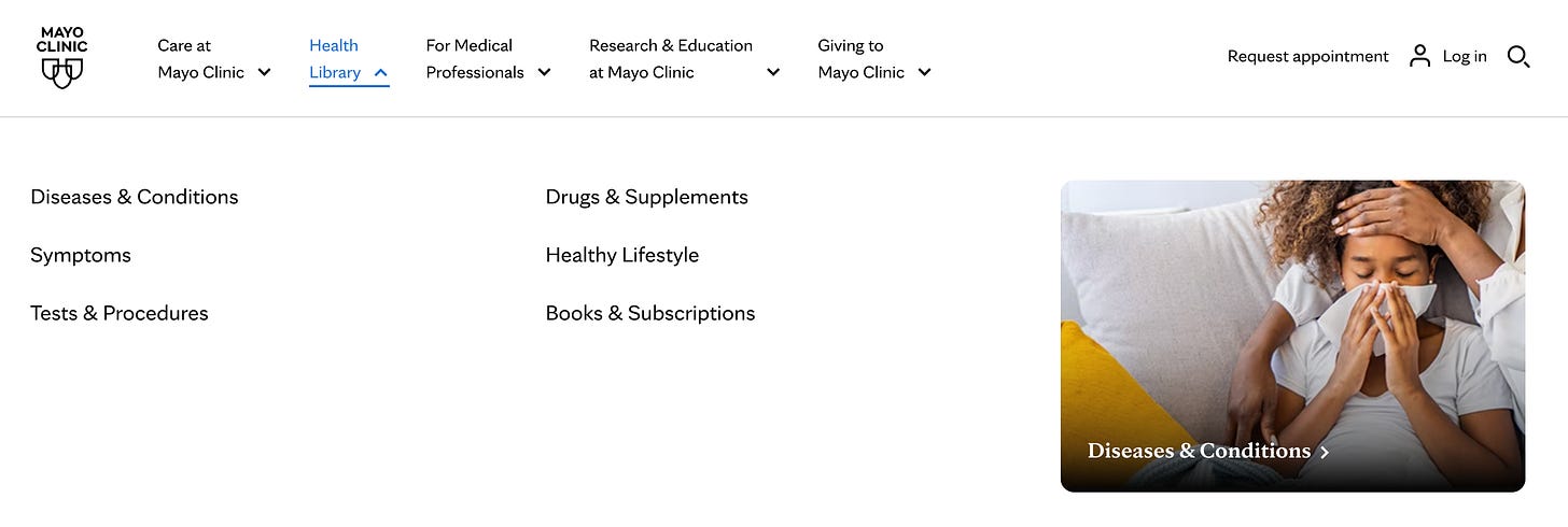
www.mayoclinic.org The site effectively categorizes information into distinct sections like “Diseases & Conditions,” “Tests & Procedures,” and “Drugs & Supplements.” This clear categorization, coupled with a prominently positioned search bar, enables users to quickly and easily find the information relevant to their queries. For instance, a user looking for information on diabetes can effortlessly navigate to the “Diseases & Conditions” section or use the search bar to directly find relevant content.
Moreover, the Mayo Clinic website enhances user experience by providing additional navigational aids, such as breadcrumb trails and clickable tags related to specific topics. These features help users understand where they are on the site and how to navigate back to previous sections or explore related topics. The inclusion of patient and visitor guides is another thoughtful addition, guiding users through hospital services, appointments, and visiting hours.
This approach to navigation design is particularly beneficial in the healthcare context, where users may be seeking critical information under stressful conditions. An easy-to-navigate website can significantly reduce user frustration and ensure that vital information is accessed quickly and efficiently.
Simplified navigation not only benefits the user experience but also reflects positively on the healthcare provider, portraying them as patient-centric and attentive to the needs of their visitors. Healthcare websites can achieve a balance between comprehensive information provision and ease of access, making them more effective and user-friendly.
-
Responsive Design: A Mobile-First Approach
The significance of a mobile-first approach in healthcare website design has become more pronounced than ever. With the increasing reliance on mobile devices for internet access, responsive design is essential. Statistics reveal that as of 2023, about 58.8% of the world’s population can access online web portals, a number that has been steadily growing over the years. The shift towards mobile internet usage is evident, with reports indicating that mobile internet usage accounted for around 58% of all website traffic in 2019.
58% of global website traffic came through mobile devices.
Moreover, the average American spends approximately 5 hours and 24 minutes on their mobile device each day. This high engagement level underscores the need for healthcare websites to be optimized for mobile use, ensuring that content is easily accessible and navigable on smaller screens.
A mobile-first design strategy involves creating adaptable layouts, touch-friendly interfaces, and ensuring fast-loading pages. These are critical aspects for users who are increasingly seeking information on-the-go. It’s about prioritizing the mobile experience in design and functionality to accommodate the growing number of users who rely on their smartphones for internet access.
As the healthcare industry continues to embrace digital transformation, understanding and implementing a mobile-first approach in website design is not just a trend but a necessity. This strategy ensures that healthcare websites are accessible, functional, and provide a seamless user experience across all devices. The goal is to cater to the broad spectrum of users, many of whom are increasingly turning to their mobile devices for health-related information and services.
-
Trustworthiness: Establishing Credibility:
Trustworthiness in a healthcare website is multifaceted, encompassing aspects such as content accuracy, source authority, user-friendly design, and the availability of support for users. The perceived quality of information on these websites plays a crucial role in building initial trust, which is a key determinant in the decision-making process of users seeking health information online. This initial trust is influenced by the user’s perception of the information’s currentness, accuracy, relevance, usefulness, and completeness.
88% Of Consumers Trust Online Reviews As Much As Personal Recommendations
The impact of trust on consumer behavior is substantial. For instance, a significant 88% of consumers trust online reviews as much as personal recommendations, highlighting the importance of managing online reviews to maintain and enhance credibility. Additionally, the trust between a patient and a healthcare provider is linked to improved patient experiences and health outcomes, underscoring the critical need for healthcare organizations to focus on rebuilding and maintaining trust, especially among diverse communities.
These insights into the role of trust in healthcare emphasize the need for healthcare websites to not only provide high-quality and accurate information but also to present it in a user-friendly and accessible manner. By doing so, healthcare providers can significantly enhance user engagement, satisfaction, and ultimately, trust in their services.
-
User-Centric Content: Communicating Effectively:
User-centric content is essential for healthcare websites. This approach involves creating content that directly addresses the needs, concerns, and questions of the audience. Clear, jargon-free language is crucial to ensure that information is accessible and understandable to a broad audience, including those without medical backgrounds. Educational content, like health tips, guides, and blog posts, plays a significant role in engaging users and providing them value.
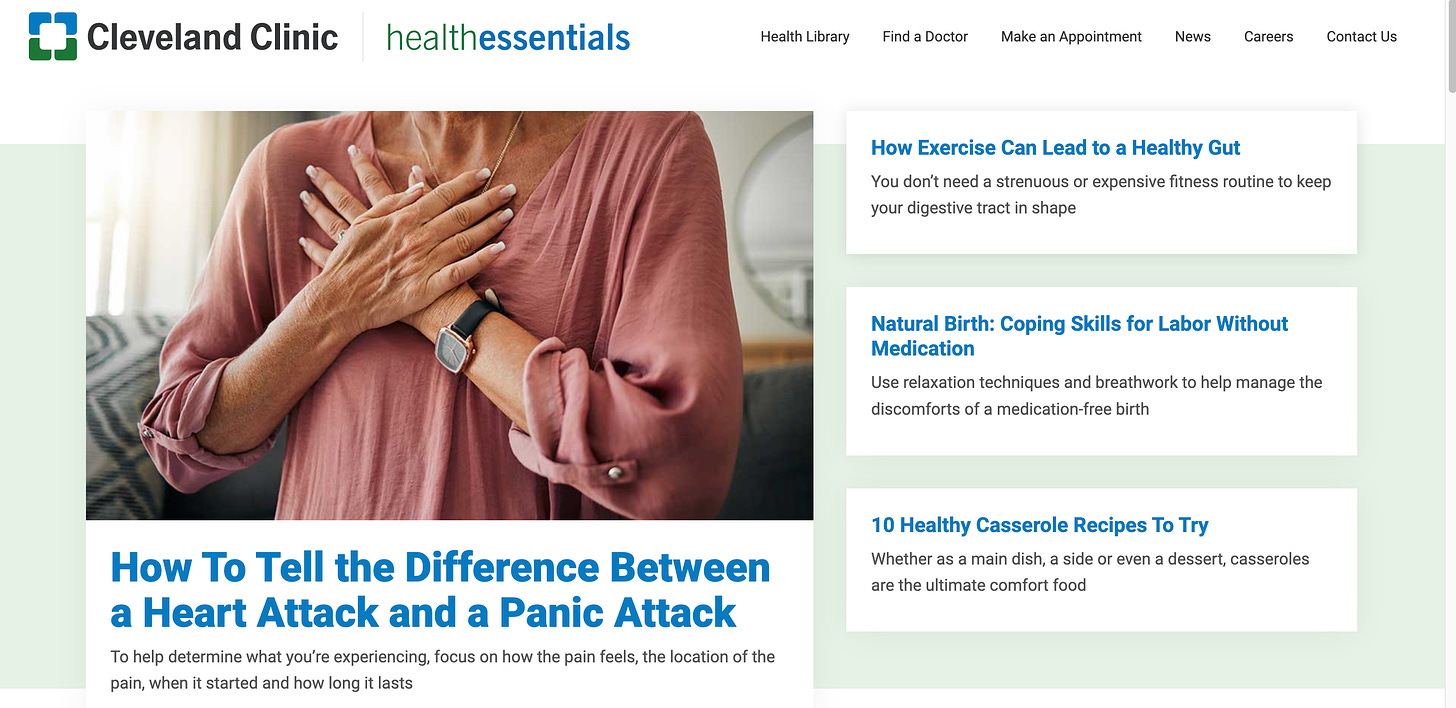
For example, the Cleveland Clinic’s Health Essentials website is an excellent model of user-centric content. It features a wide array of articles and resources on topics ranging from managing chronic illnesses like diabetes or heart disease to wellness advice like nutrition and stress management. These resources are crafted in simple language and provide practical, actionable advice, making them directly relevant and beneficial to patients’ concerns. This kind of targeted, informative content not only educates but also builds a connection between the healthcare provider and the users, fostering trust and establishing the provider as a reliable source of health information.
-
Visual Design: Creating a Comforting Atmosphere:
The visual design of a healthcare website is crucial in creating a comforting and professional environment. This is achieved through thoughtful color choices and imagery that evoke a sense of tranquility and care.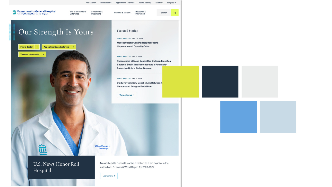
Massachusetts General Hospital For example, Massachusetts General Hospital’s website exemplifies this approach. They use a palette that includes deep blues, conveying a sense of trust and calmness, which is balanced with softer, soothing tones. This color scheme, along with their use of high-quality, relatable imagery, helps establish an atmosphere of professionalism and compassion.
Additionally, the website’s layout is designed to be clean and uncluttered, prioritizing user-friendly navigation. This is particularly evident in their health library section, which utilizes well-designed visuals and charts to explain complex health conditions. Such graphical elements make the site not only visually appealing but also functionally informative, aiding visitors in easily understanding medical content. The Massachusetts General Hospital website’s visual design strategy effectively makes complex medical information accessible and less intimidating, enhancing the overall user experience.
-
Interactive Elements: Enhancing User Engagement:
Interactive elements such as chatbots, appointment schedulers, and symptom checkers can greatly enhance user engagement on healthcare websites.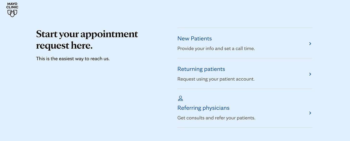
Mayo Clinic These tools offer a level of personalized interaction and quick responses that are highly valued in the digital healthcare space.
For example, the Mayo Clinic’s website includes an interactive symptom checker that guides users through a series of questions to help identify potential conditions based on their symptoms.
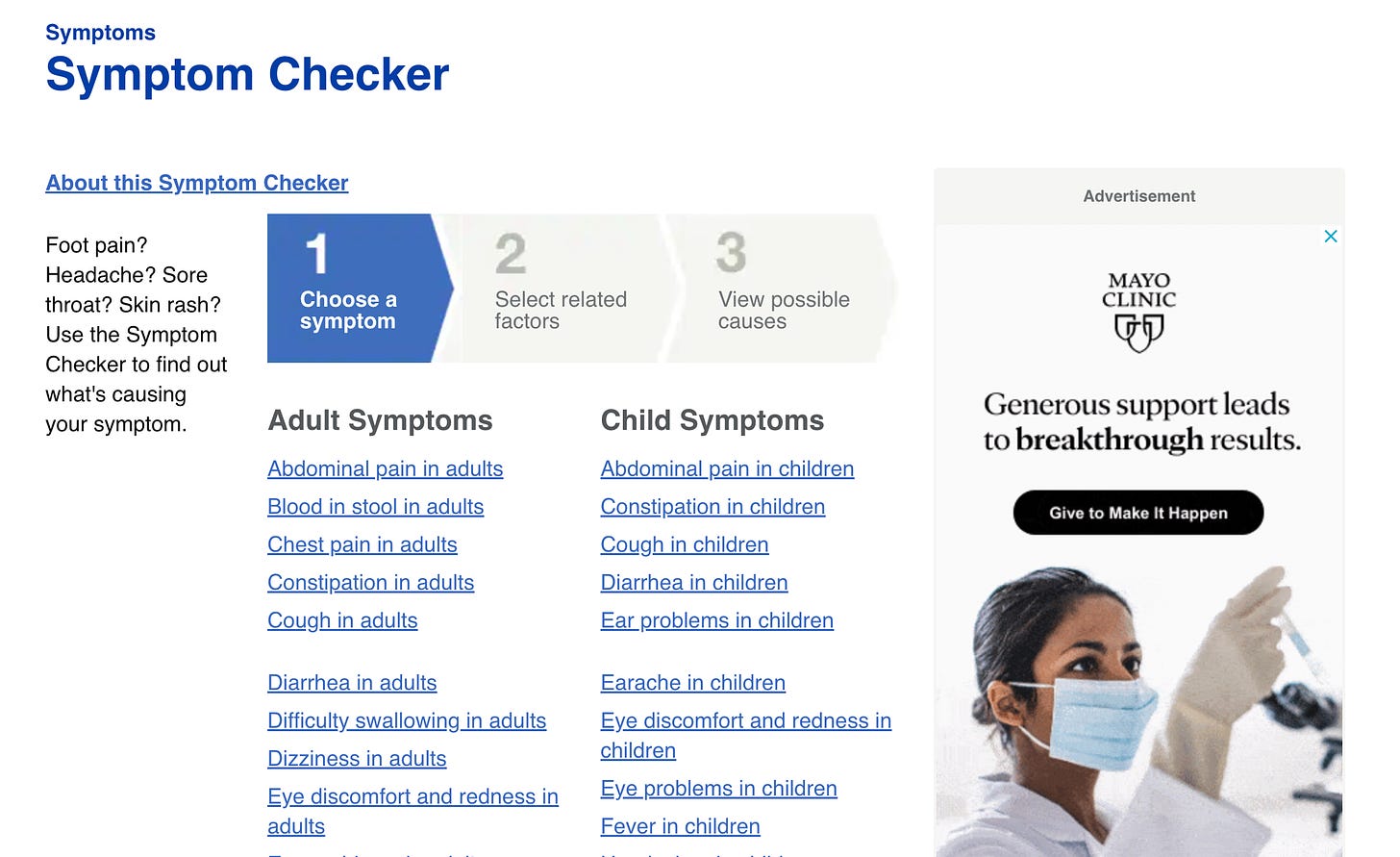
Mayo Clinic Symptom Checker This tool not only engages users but also provides them with valuable preliminary health information. It’s crucial for these features to be integrated seamlessly into the website, ensuring they are intuitive and enhance the overall user experience without becoming intrusive or overly complex.
The intersection of UX design and healthcare presents unique challenges and opportunities. By focusing on these seven key UX factors, healthcare providers can create websites that are not only functional and informative but also empathetic and engaging. Remember, at the heart of an effective healthcare website is an experience that resonates with and supports the needs of its users. As digital interactions continue to play a crucial role in healthcare, providers who prioritize UX in their web design are better positioned to connect with and serve their communities.


