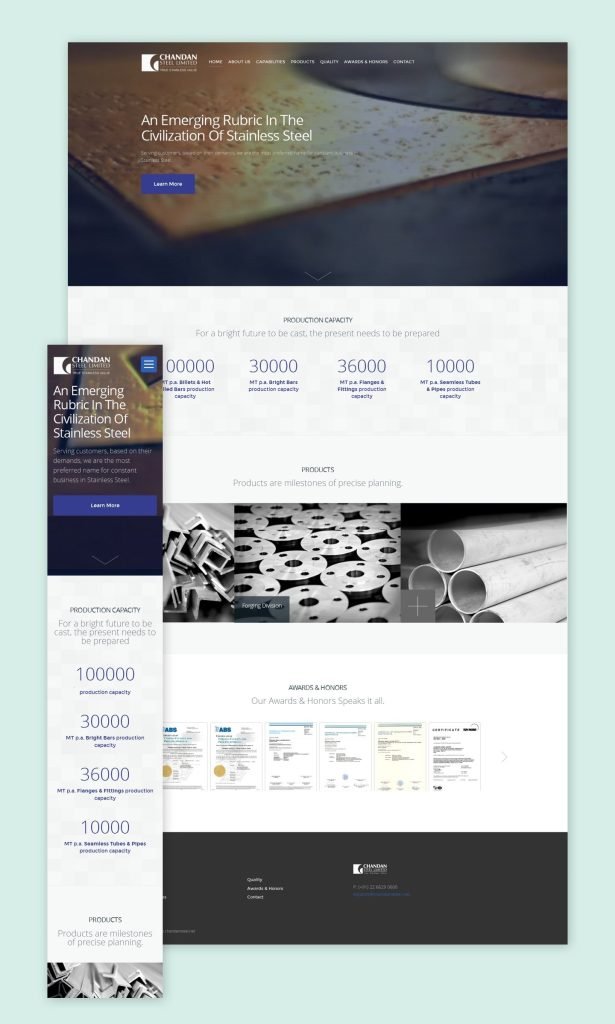
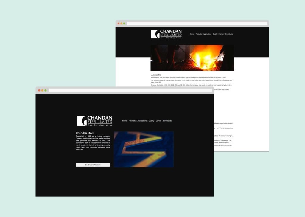
Turning the Chandan Steels website into something new, step by step.
- Starting the Project: I began by really getting to know the people who use the website and what they need from it. It wasn’t just about checking out other websites or talking to the big bosses. I looked closely at the numbers and saw how people actually use the site. This helped me figure out who our users are and what they’re looking for, laying down the first pieces for making the Chandan Steels website better.
- Planning How Users Move Through the Site:
After that, I started sketching out the path users would take on the site. It was like drawing a map so they wouldn’t get lost and would enjoy the journey. I put together a simple layout and started drawing the first designs. This step was all about making sure when someone visits the site, they know where to go and what to do, without getting frustrated or bored. - Testing My Ideas:
Next up, I showed my rough ideas to the people who know the business inside out. This was to make sure what I was thinking made sense not just to me but also to them. It was about checking if my designs were on the right track before making them look nice. This step was crucial because it helped me tweak and improve my ideas. - Making the Site Look Great: With all the feedback and ideas in place, I dived into choosing colors, fonts, and styles for the website. I picked each one carefully, thinking about what Chandan Steels stands for and what people visiting the site would like to see. This part was exciting because I got to bring everything to life, turning my sketches and ideas into a real, working website that looks good and feels right to the people using it.


